New colours, new look, new website! 🎊
Today we’re launching our brand new website with our first referral program. We listened to our first couple of users and came to the…

Today we’re launching our brand new website with our first referral program. We listened to our first couple of users and concluded that it was time for a major update. So we went back to the drawing board.
Why did we update our brand and website?
We designed & built our first website in a week because its only purpose was to validate the idea of Proptee. If you can remember, it was mainly white with a boring blue colour. The text was hard to read and the photos were of low quality.
Once people started signing up, we emailed everybody personally from our waiting list. We were shocked to see that they sent us long, detailed answers about their problems with property investing. The responses were amazing.
Finally, we could justify that we might be onto something here.
What’s new?
In one word: Everything.
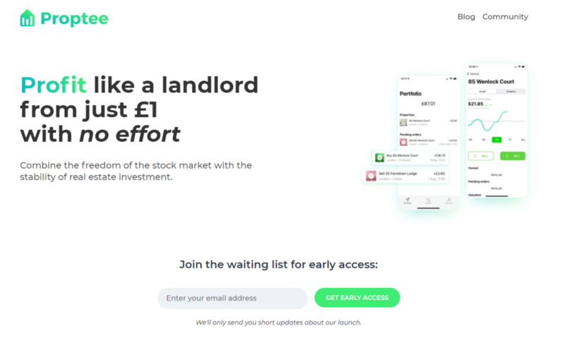
We went back to the drawing board to make sure that everything looked clean and conveyed the message clearly before launching our first marketing campaign “Profit like a landlord from just £1 with no effort” (we’ll talk about it in a future post).
Layout
We redesigned the sections to have a clear and understandable design. The order of the sections is:
- Benefits
- Safety & regulation
- How it works
- Team
Simple content
We kept everything short and simple, so you don’t get scared of our investment product. Don’t worry, there is nothing to be scared about.
Modern colours
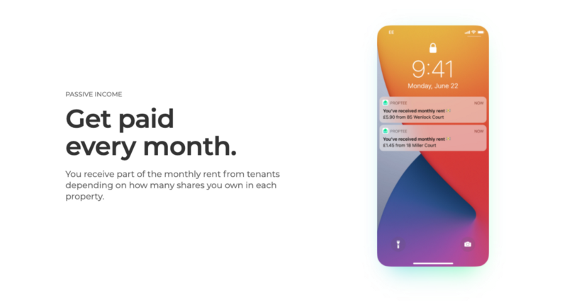
Playing with a random colour palette generator we concluded that we want to have something that’s friendly and has the modern feel of 2020. This is what we ended up with

Minimalistic design
Absolutely love the landing page! You’ve captured the trending modern minimalist look well. Love the snapshots of what it could be one day. Good luck to the team! — Jonathan
We made sure we kept a friendly and “millennial” look. As all stock investment app landing pages look the same, Proptee had to be different. We’re doing something new after all.
Check it out yourself
Visit PROPTEE.IO
Don’t forget to leave your feedback here!✍️